Monday, October 29, 2012

Upper Crust Urchins - Mining This Vein

Upper Crust Urchins

I can tell I'm not finished with this creative vein - my sketchbooks are filling up with spikes. The challenge of engineering attachments for these puppies is fascinating me. I don't want to settle for drilling holes in the sides at the top to string wire through - feels like taking the easy way out - so what now? These are a little more glam than the previous urchins, so I don't want to wire them the previous way. I want them to appear more refined rather than funky, so I'm playing with "hats". Of course, that's taken me completely off course again!!! Either I'm very easily distracted (read "child-like" - which, for a mature individual like myself, is not necessarily a bad thing) or I'm really obsessive/compulsive (which is more of a problem for The Arctic Fox than for me) Stream of consciousness: hats - caps - berets - bowlers - crowns - clowns (what?!!!) - ruffles - lace - collars - ok, that gives me some fodder to start with. The wire has to be embedded in them and they have to be firmly affixed. I can engineer that. Maybe they won't all be the same. Maybe pairs of different "toppers". 


I also want to limit my choices so I don't struggle with too much material, so I'll keep colours to rich brown, warm gold and dark silver. To limit choices more and because I love to make life challenging, the designs will be only dots - but I do believe in feeding my one obsession (did I say ONE?) - bling - so bling will be included in the various potential permutations and combinations. I must admit, I'm a math geek, so I love seeing how many unique arrangements I can come up with under these constraints.


A few more close-ups.

Monday, October 15, 2012

Creating for the Consumer - The Delicate Dance

Poe's The Telltale Heart


The Time of the Dastardly Deed: 1:00 am
The Black Heart
Creating original wearable art is like dancing the Tango - sometimes you're the aggressor, other times you're the aggressee. Your first decision is: Do I want to sell this piece or not. If the answer is "no", then go nuts. But if the answer is "yes", then you have to dance the delicate dance. You want to be true to your creative muse, but you have to take into account the sensibilities of your audience, so you first have to decide what your demographic is. I design for people who enjoy and appreciate works of art. I want to make my own statement, but I have to be careful about not saying it in a vulgar way.


 In these Book Bracelits it's important for me to visually express my love of these stories, the part of me that is attracted to Poe and Lovecraft. So how do you do gothic without going gruesome?


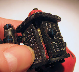
The Lantern with a Thin Gleam of Light
 The anatomically correct heart is an important part of my signature elements (remember the anatomically correct brain in the previous post?) Since I could make the heart black and colour the veins and arteries as they are coloured with latex rubber in the lab for students learning to dissect, it's realistic without being too realistic.

The watery blue eyeball, on the other hand, was gross! The very thought of it led to murder most foul! So the watery blue eyeball, per se, was a problem. The neat thing about being forced to rethink your ideas is that you often come up with an even better, a more creative idea. That's what happened here. How do you convey the image of a watery blue eyeball without making one? You "suggest" one!

I frequently encourage my students who take my abstract painting workshops to "suggest without defining". In so doing you often find your own personal marks. I followed my own advice.


The Watery Blue "Eye" ball

I love puns. In working out this problem, the solution became a visual pun, and I absolutely love it! To suggest its fragility I put it in a red (i.e. blood-soaked) hanky with the suggestion of lace pattern to re-inforce the idea of "delicate", yet be jarringly incongruous in the context of a severed eyeball.

The final piece represents the floorboards beneath which the perpetrator buried the victim.

Story told! THE END


The Floorboards


Tuesday, October 9, 2012

The Wizard of Oz - Unifying Your Designs


Book Brace'lits' -The Wizard of Oz - the brain, the book and the tornado (with crystal bling inside)
a moderately steampunked interpretation
(click on the pictures for larger images)

From time to time I make book bracelets, called Book Brace'lits', of classics that I love. They tend to get noticed wherever I go, probably because they are graphic, different, and recognizable to a slight degree, enough so that people are intrigued and ask to see them close up. Over the next couple of weeks I need to paint, so I will introduce these bracelets to you and use them to illustrate design principles and elements that can make your work stronger and give it more impact and appeal.

One problem in creating an overall work of art is to have it look like the last part you created belongs in with the other parts. I often find that artists get caught up in one part of the piece at a particular time, doing things in a way the intrigues them at the moment, then later on, they work like a totally different person, using different approaches, techniques, content, what have you. Yes, we like to do what we want when we want, and exploring different techniques is fun, but too many "differences" within the same piece can make the viewer feel that certain parts just don't belong on that piece. 


The Red Shoes

A key design principle to keep in mind is UNITY. To read well a piece needs to be unified. What design elements contribute to that in this work? COLOUR is the main element. I mixed a slightly muted, metallic red in Kato clay and this colour, plus gold, are the key colours that hold all the pieces together, unifying the bracelet.


The Badge of Courage - my visual interpretation of the quest of the cowardly lion and The Farmhouse in Kansas


Because there are so many disparate visual elements in these bracelets, another principle of design that strengthens the feeling of unity is REPETITION. Between each of the elements you will see a handmade clay spacer bead, each of which also contains the unifying red colour.


The Heart - the quest of the tinman - this heart is personalized with the initials of the lady for whom this was made. Also, a side view of the steampunked brain,

The Brain - the quest of the straw man (and quite anatomically correct, thus shutting up my very persistent left brain!)