Thursday, December 20, 2012

The Wind Whisperer

The Wind Whisperer

No more Mr. Nice Guy, or should I say, no more "pretty" stuff. I'm caught up in imagery and story-telling and that's going to be the focus for the foreseeable future. It's like with my paintings - I'm drawn to old (no, not I AM old, I'm DRAWN to old!!!), slightly grungy, stuff with history or herstory or, at the least, a story. The more illusory, the better - more like sagas and runes and eddas - stories with lots of word-of-mouth distortions that may or may not be true, yet spin emotional realities in the unfolding. "Unfolding", "enfolding"... yummy words that keep me awake at night spinning verbal visuals that I find enthralling. So... jumping in with both feet, hairy and grungy, but excited to take the next steps.

The first birth: The Wind Whisperer. She sits quietly on the rocky outcrop, gazing raptly through the fir boughs for glimpses of star-strewn sky, the black velvet of night like a warm caress. Can't let the moment enfold her - there are stirrings by the bridge! The wind teases wisps of hair across her forehead. "I hear her", she whispers, "She's awake!" The soughing rises and branches punctuate the symphony with their brittle talk.
"Hush," the Wind Whisperer cautions, "The time is not right, not yet!"

This piece will walk with you through the moss-coated trees and maybe, just maybe, you'll hear the breath of a soft whisper.

The important thing for me in these pieces is that most of it be of my imagination. Except for the odd glass or stone bead, when that bright bit of glimmer becomes essential, the remaining oddments and fragments and antiquities and relics are made by me from polymer clay, metal, and an assortment of mixed media. The shapes are important, as is their arrangement. I'm still figuring out what's gestating here. I'll say more when more unfolds.

A few close-ups:


Saturday, December 8, 2012

Kuvianartok

Kuvianartok Nanuk
 
Meet Kuvianartok, the polar bear. His appearance made a lovely lady happy yesterday and he agreed to go home with her to meet her daughter. He's one of the steampunk elements that I enjoy so much developing. Steampunk evokes a wonderful nostalgia, a hankering back to a time when technology was understandable (one gear causes another gear to turn, like clockwork, right?) and the era romantic. Think Jules Verne's the Nautilus and the time it was set in with elegant, flowing costumes and beautiful art nouveau/art deco architecrture and accoutrements, a far cry from nanobots and microchips and writing computer code on the surface of molecules. I love the contrast between the smooth, flowing lines that you want to stroke and the spikey metal gears and cogs that say, "Ouch!" It was a time of lace and leather, metal and grime, glass and velvet. What an evocative era.
He says he feels like he's flying!

One of the things I love about polymer clay is its ability to mimic virtually anything found in nature. Let's talk a bit about leather. I have had many comments on my simulated leather. Some clay artists will use real leather as a texture tool to imprint the clay surface. For me, what "suggests" leather is wear-and-tear and stitching. So, using just the needle tool, I make the stitch holes, depress a line between the holes to emulate stitches, then use the tip of the needle tool to push and nudge the edges of the leather to simulate dings and wear, and scratch gently and quickly across the surface to emulate creased, crinkled, worn leather. When you then antique with oil paint, all these little edge and surface imperfections add to the impression of aged leather.

Thursday, December 6, 2012

Planning Ahead


When designing a specific piece, such as the commissioned necklace for a wedding last summer, consider making more beads than you need. That way, if a couple don't look that great, you can choose the best ones, or you have left-over beads for making matching earrings, or, for designing a totally different piece, as you see here. The two side beads were left over from the original necklace, and the focal spiral lentil bead was made from the left-over scrap.

Wednesday, December 5, 2012

Studio Tip #4 - Working With Resin

The Sludge Jar
(click on images for larger photos)

No, I have not branched out into alchemy, although I do find some of the ancient premises fascinating. The creative scientist in me is always driven to defy accepted limitations. This, my friends, is my "Indiana Jones" moment, my crystal skull, if you will. Working with mixed media, resin is a regular tool. One problem with resin is that it sticks - sometimes where you don't want it to. We know it does not stick to polyethylene (white kitchen garbage bags) which is why my studio worktable is covered with garbage bags. You can drop left-over resin onto the plastic and, two days later, peel them right off to use elsewhere. But I digress.


When a resinned surface needs to be sanded down to remove bubbles or schmutz, it's almost impossible to sand and buff the surface to achieve that initial, brilliant shine. It's much easier to brush on a new coat of resin which seals all the scratches and marks and gives a brilliant shine again. That's what I had to do with the pendant below, and you can see it looks like new.
In order to brush on the liquid resin, you need to use a brush, and every professional I've spoken to says the brush is toast afterwards - toss it in the garbage. I love to brush resin onto stamped tissue paper, but the idea of using a sponge (soaks up a ton of resin and has to be thrown out afterwards) or a brush that would have to be sacrificed is not acceptable. (I'll talk about the pros of using resin to coat tissue paper over using liquid clay another time). So, time to experiment. I've used several products in my art-life that I have talked about in my workshops, getting a kiss on the cheek from one student's husband because he had been able to recondition all his old acrylic paint-encrusted brushes to supple new softness - but I digress again. I hauled out "The Sludge Jar", the jar I use to clean my paint brushes after antiquing clay with oil paint. It contains:

I dipped the still wet resin-coated paint brush into the sludge jar, schlumped it around a couple of seconds, wiped it off on a paper towel, rubbing gently in between bristles, and voila!


Some pics of resin work in progress for the weekend show.


Tuesday, December 4, 2012

The Mocking Bird or Unintended Consequences

The Mocking Bird or Unintended Consequences

Whooping Cough! It didn't creep up on me - dazed I looked around for a license plate, thinking the driver of the tractor trailor that slammed me into the asphalt should at least be made to pay! Then I looked on the bright side: I'm sick, I can't be expected to do any mundane things, so I can guiltlessly devote myself to the studio and my right brain - in other words, it's sort of a vacation!!! 6 weeks of quarantine later, after repeatedly trying my best to cough up a lung (or maybe at least a bronchiole) I'm faced with the realization that there is no working, nor devising, nor talking, in Whooping Cough.

I'm back, well, at least, my intentions are back. I'm hoping the rest will follow. 

On the bright side, the Village Queen sold virtually immediately, along with a faux jade bracelet, so the boutique wants more of me. That having been said, I was sort of, kind of hoping that the Village Queen wouldn't sell. I really wanted to wear her. Ah well, such is our dilemma. When we make something we're really proud of, we then have to face the prospect of taking a paltry two hundred to part with it (happy face!!!)

Friday is the start of a two-day show (and sale) so virtually all I have been able to accomplish is to finish off the myriad of things I have been experimenting with over the past  year. The Mocking Bird, pictured above, was supposed to be a spinner ring, with Saturn prominently displayed in the middle and it's rings and satellites spinning in orbit. Somehow it ended up as above, a metaphor for great big ideas that I had, turning out to be mocking bird eggs, deposited in my fertile nested brain, nurtured by my innocent musings, only to hatch into an unintended consequence that ate up all of my initial intentions. Life's like that.

Monday, October 29, 2012

Upper Crust Urchins - Mining This Vein

Upper Crust Urchins

I can tell I'm not finished with this creative vein - my sketchbooks are filling up with spikes. The challenge of engineering attachments for these puppies is fascinating me. I don't want to settle for drilling holes in the sides at the top to string wire through - feels like taking the easy way out - so what now? These are a little more glam than the previous urchins, so I don't want to wire them the previous way. I want them to appear more refined rather than funky, so I'm playing with "hats". Of course, that's taken me completely off course again!!! Either I'm very easily distracted (read "child-like" - which, for a mature individual like myself, is not necessarily a bad thing) or I'm really obsessive/compulsive (which is more of a problem for The Arctic Fox than for me) Stream of consciousness: hats - caps - berets - bowlers - crowns - clowns (what?!!!) - ruffles - lace - collars - ok, that gives me some fodder to start with. The wire has to be embedded in them and they have to be firmly affixed. I can engineer that. Maybe they won't all be the same. Maybe pairs of different "toppers". 


I also want to limit my choices so I don't struggle with too much material, so I'll keep colours to rich brown, warm gold and dark silver. To limit choices more and because I love to make life challenging, the designs will be only dots - but I do believe in feeding my one obsession (did I say ONE?) - bling - so bling will be included in the various potential permutations and combinations. I must admit, I'm a math geek, so I love seeing how many unique arrangements I can come up with under these constraints.


A few more close-ups.

Monday, October 15, 2012

Creating for the Consumer - The Delicate Dance

Poe's The Telltale Heart


The Time of the Dastardly Deed: 1:00 am
The Black Heart
Creating original wearable art is like dancing the Tango - sometimes you're the aggressor, other times you're the aggressee. Your first decision is: Do I want to sell this piece or not. If the answer is "no", then go nuts. But if the answer is "yes", then you have to dance the delicate dance. You want to be true to your creative muse, but you have to take into account the sensibilities of your audience, so you first have to decide what your demographic is. I design for people who enjoy and appreciate works of art. I want to make my own statement, but I have to be careful about not saying it in a vulgar way.


 In these Book Bracelits it's important for me to visually express my love of these stories, the part of me that is attracted to Poe and Lovecraft. So how do you do gothic without going gruesome?


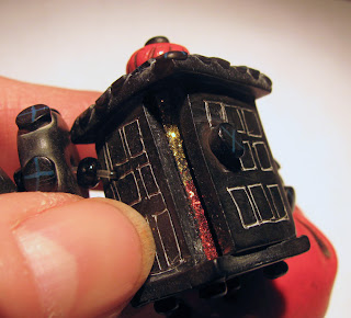
The Lantern with a Thin Gleam of Light
 The anatomically correct heart is an important part of my signature elements (remember the anatomically correct brain in the previous post?) Since I could make the heart black and colour the veins and arteries as they are coloured with latex rubber in the lab for students learning to dissect, it's realistic without being too realistic.

The watery blue eyeball, on the other hand, was gross! The very thought of it led to murder most foul! So the watery blue eyeball, per se, was a problem. The neat thing about being forced to rethink your ideas is that you often come up with an even better, a more creative idea. That's what happened here. How do you convey the image of a watery blue eyeball without making one? You "suggest" one!

I frequently encourage my students who take my abstract painting workshops to "suggest without defining". In so doing you often find your own personal marks. I followed my own advice.


The Watery Blue "Eye" ball

I love puns. In working out this problem, the solution became a visual pun, and I absolutely love it! To suggest its fragility I put it in a red (i.e. blood-soaked) hanky with the suggestion of lace pattern to re-inforce the idea of "delicate", yet be jarringly incongruous in the context of a severed eyeball.

The final piece represents the floorboards beneath which the perpetrator buried the victim.

Story told! THE END


The Floorboards


Tuesday, October 9, 2012

The Wizard of Oz - Unifying Your Designs


Book Brace'lits' -The Wizard of Oz - the brain, the book and the tornado (with crystal bling inside)
a moderately steampunked interpretation
(click on the pictures for larger images)

From time to time I make book bracelets, called Book Brace'lits', of classics that I love. They tend to get noticed wherever I go, probably because they are graphic, different, and recognizable to a slight degree, enough so that people are intrigued and ask to see them close up. Over the next couple of weeks I need to paint, so I will introduce these bracelets to you and use them to illustrate design principles and elements that can make your work stronger and give it more impact and appeal.

One problem in creating an overall work of art is to have it look like the last part you created belongs in with the other parts. I often find that artists get caught up in one part of the piece at a particular time, doing things in a way the intrigues them at the moment, then later on, they work like a totally different person, using different approaches, techniques, content, what have you. Yes, we like to do what we want when we want, and exploring different techniques is fun, but too many "differences" within the same piece can make the viewer feel that certain parts just don't belong on that piece. 


The Red Shoes

A key design principle to keep in mind is UNITY. To read well a piece needs to be unified. What design elements contribute to that in this work? COLOUR is the main element. I mixed a slightly muted, metallic red in Kato clay and this colour, plus gold, are the key colours that hold all the pieces together, unifying the bracelet.


The Badge of Courage - my visual interpretation of the quest of the cowardly lion and The Farmhouse in Kansas


Because there are so many disparate visual elements in these bracelets, another principle of design that strengthens the feeling of unity is REPETITION. Between each of the elements you will see a handmade clay spacer bead, each of which also contains the unifying red colour.


The Heart - the quest of the tinman - this heart is personalized with the initials of the lady for whom this was made. Also, a side view of the steampunked brain,

The Brain - the quest of the straw man (and quite anatomically correct, thus shutting up my very persistent left brain!)

Sunday, September 30, 2012

Finished Scrap Clay Lentil Beads

Here is the final product, sanded 1,000, 1,200 and 1,500, then buffed on the foredom. You can see how beautifully the edges retain their colour and contribute to the spiral pattern.